


PhonePe Fixed What Wasn't Broken (And Users Are Mad)
PhonePe's new UI update has 500M users divided. See the before/after comparison and find out if the redesign makes the app better or worse to use.

Most apps don’t change just to look pretty.
They redesign when they are trying to do something bigger, like push new services, get users to spend more time, or stand out from growing competition.
That’s what makes PhonePe’s redesign interesting.
It reorganized the entire experience, from how you scan to how you save.
Let’s see what changed… and whether it helps users do what they came for.
Original PhonePe UI
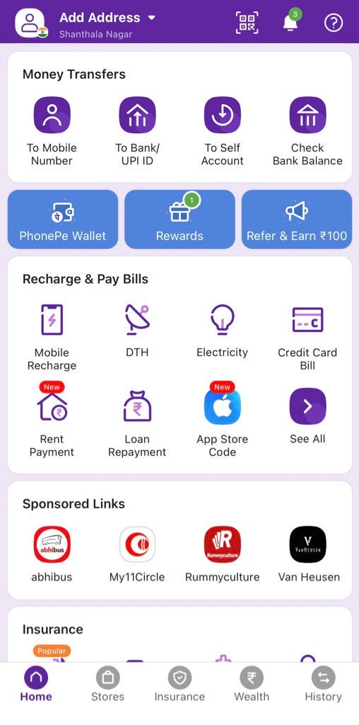
Here's how the old PhonePe app worked:
Navigation at the bottom
The bottom of the screen had basic buttons, such as Home, History, and Profile. These buttons looked normal, and people knew how to use them.Everything grouped together
All the services were put into big groups, such as Pay Bills. You had to tap many times to pay your electricity bill, and the same went for other bill payments.Plain list of your payments|
When you looked at your old payments, it was just a simple list. It worked fine, but it looked boring, like another bank account statement.
New PhonePe UI
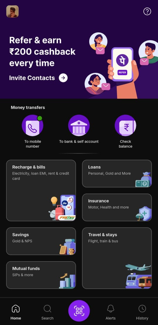
Here's what's different now:
New bottom buttons with a scanner
The buttons at the bottom are different now. The scanner (the thing that reads QR codes) is easier to find. Your payment history is also easier to get to.Better groups for services
Instead of big messy groups, now there are clear sections such as Savings and Travel. It's easier to find what you need without looking everywhere.Looks more modern
The whole app looks newer and cleaner. It has better colors and spacing. Everything looks more like other apps you use today.
What's Better? What's Worse?
Better: The new groups make more sense. If you want to save money, there's a "Savings" section. If you need to pay for travel, there's a "Travel" section.
The scanner is easier to find, which is good because most people use it a lot.
Worse: People who used the old app for a long time are confused. They can't find things as easily because everything moves around.
Some people liked the old, simple look better.
So, what do you think?
How do you feel when apps revamp their UI and UX completely?
If you were the PM who made this change, how would you measure success of the new design?
1. At first, it can be frustrating when a core action, one I’ve grown accustomed to is suddenly relocated in a redesign. That initial friction often stems from the break in habit and muscle memory. However, a guided walkthrough or in-app tutorial highlighting the new navigation or layout can significantly ease that transition. It not only reduces user anxiety but also signals intentionality behind the design, helping existing users feel considered and supported.
2. As a Product Manager, I’d closely monitor key behavioral metrics to gauge the redesign’s effectiveness. Feature discovery rate would be a priority to ensure users are finding and engaging with the relocated or new functionalities. I’d also track DAU and MAU to understand user retention trends, along with session length as an indicator of deeper engagement. Most importantly, I’d analyze drop-off points across critical flows to identify friction introduced by the new design and iterate accordingly.
I dont like it if the UI/UX is changed completely for a product i am using for a long time unless it was a big pain point for me to figure out how it works. Now with new UI/UX a new learning curve starts. I will be confused initially .
As a PM for this , i would have a close eye on guard rail metrics so that normal business like DAU,DWU, weekly/daily transactions are not impacted.
I will measure the metrics of reasons due to which this major revamp happened example - some services not used as much as we would have wanted them, use of scanner daily etc